
Website
Proposal for website
Overview: Working at ZiGi, a fashion company in NYC, I crafted email blasts, retouched product photos, designed an internal iPhone app, and offered direction on how to make changes to the website visually. I also developed mockups and plans for a new website.
Concept: ZiGi had a complex organizational structure. One of the challenges was categorizing the brands. Legally named ZiGi USA, ZiGi does business as ZiGiny and has multiple product lines, one of which is named ZiGiny. While best known for their woman's shoes, they were looking to break into men's fashion as well. In addition to the ZiGi lines, ZiGi also owned other fashion brands not yet associated with the ZiGi name. Furthermore, the different lines associated with the brand were all positioned slightly differently. For example, "blacklabel by ZiGi" was much more expensive, higher-end, and positioned as a luxury brand while ZiGi Soho was much more affordable. Upper management preferred the brands be centralized and maintained as part of the same website.
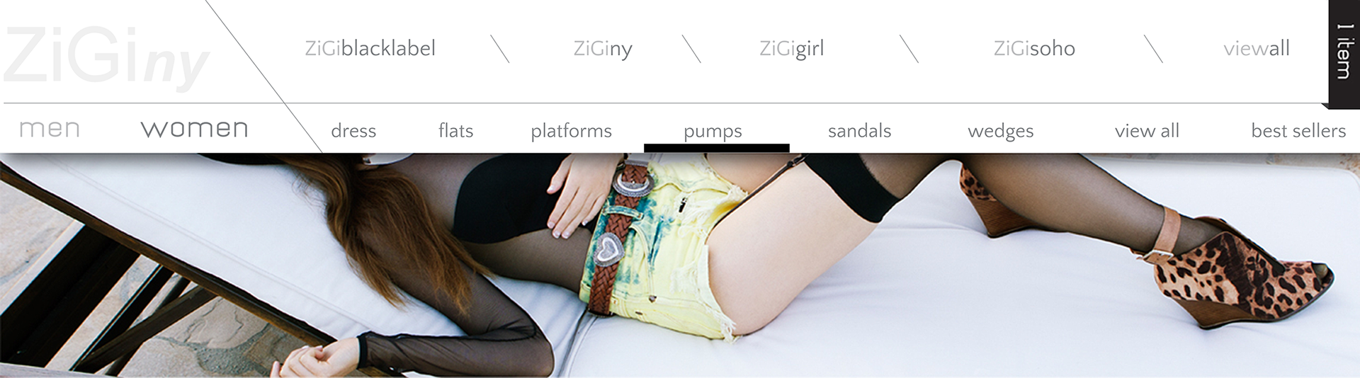
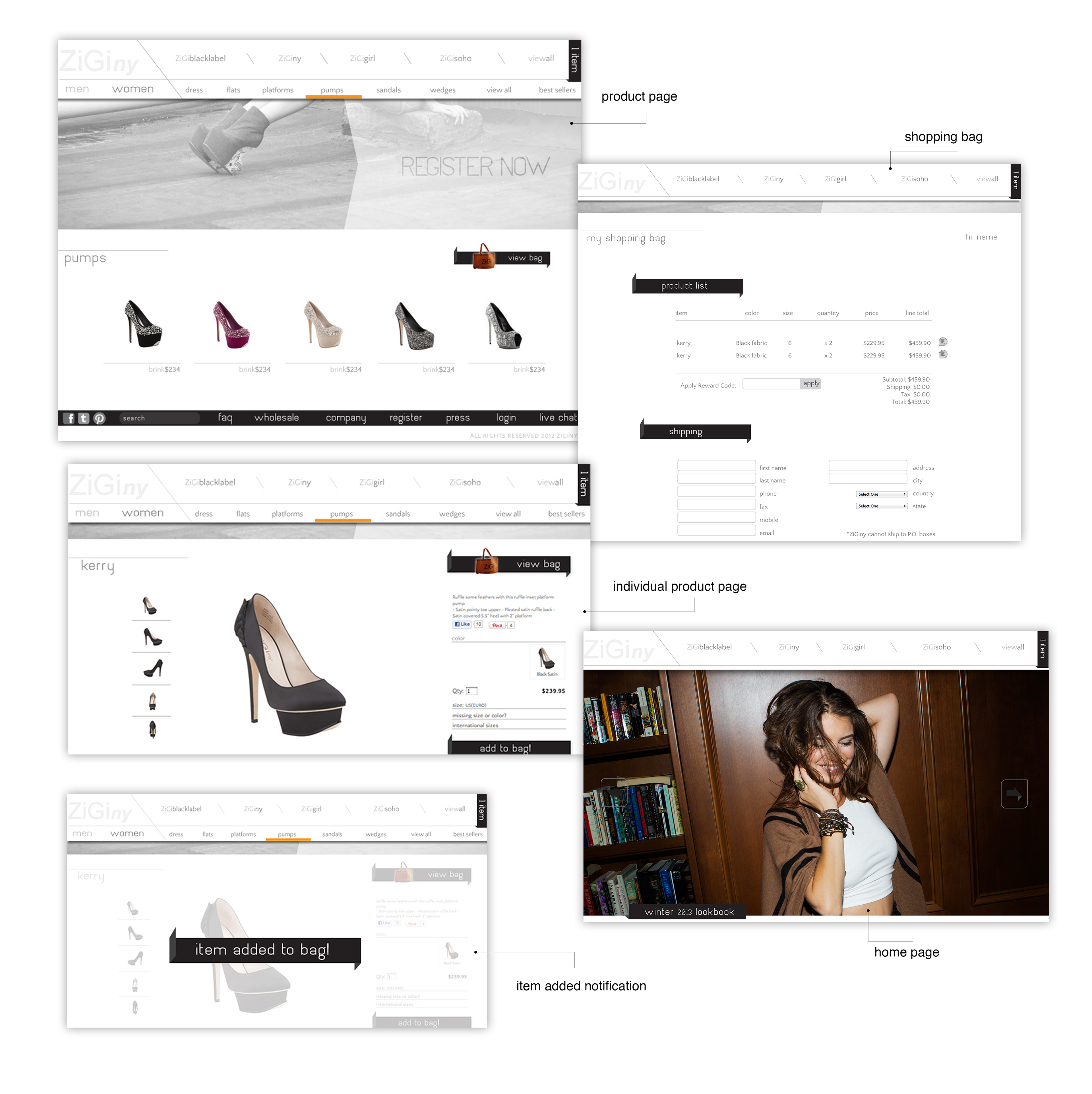
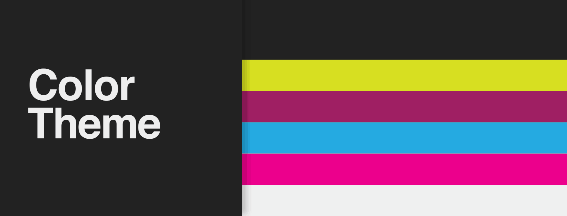
I kept the interface sleek and sexy. I tried to reduce and simplify the forms that collected and displayed information as much as possible. I built in more space to feature the stunning photography we had from the photo shoots. The navigation bar features the logo prominently displayed in the upper left and each line extension as a link on the right. Underneath the brands, I have placed the subcategories and toggle between men's and women's styles. Each line extension has its own logo and color. When placed all together, however, they look sloppy. Rather then displaying each logo, I chose to use each brand's color as an accent color to the black in the website. The accent colors also serve a functional purpose. If you look at the line in the navigation bar, it switches between black and orange. Black is the color of "blacklabel by ZiGi" while orange is the color of ZiGiny. The bar under the subcategories underscores whatever subcategory is selected but will also change to the color of the brand the user is searching for, making it easy to understand location within the site.
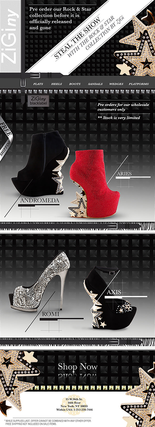
*While I retouched product photos at ZiGi, this page is only showcasing my graphic/web design layout skills. The photography was provided by ZiGi.
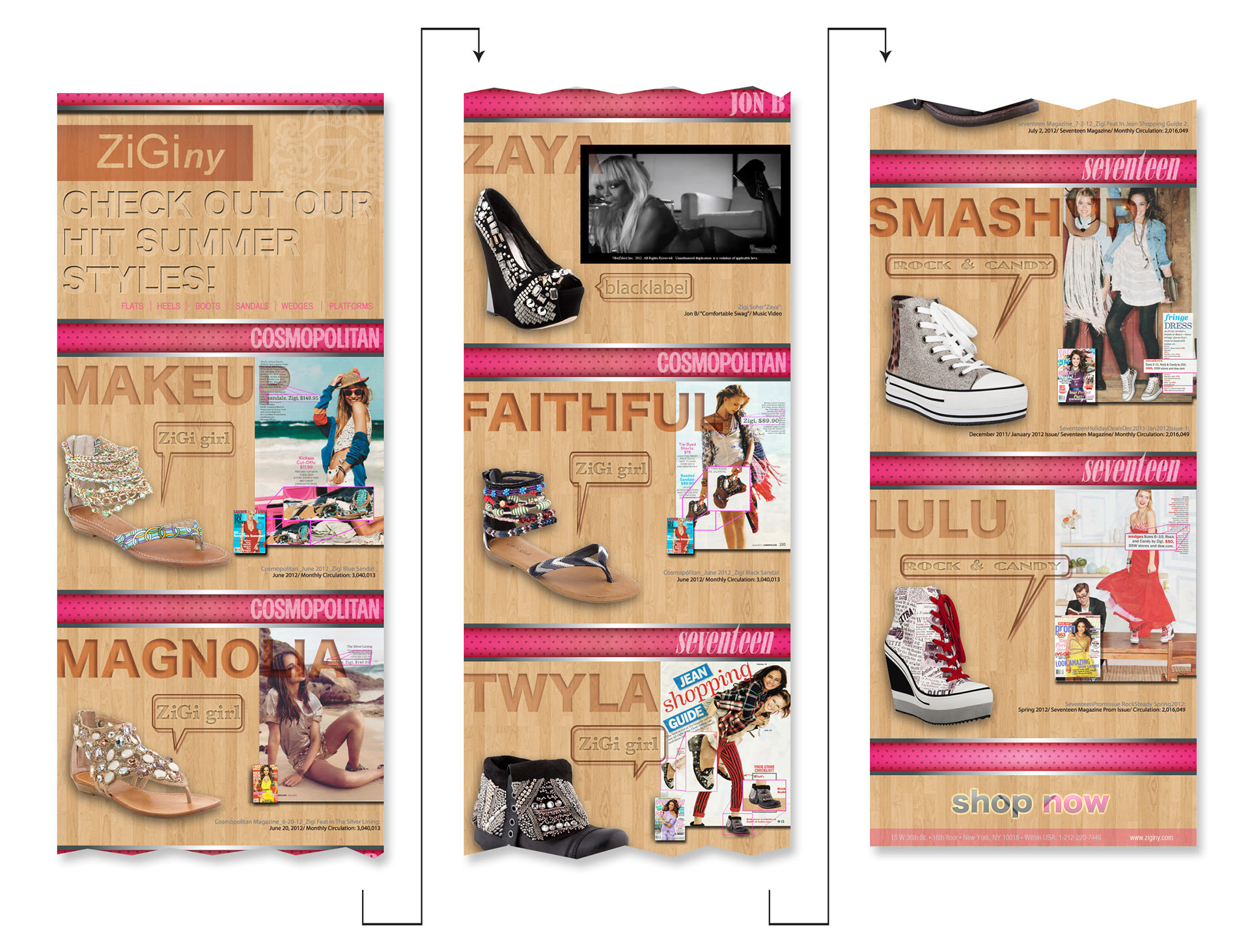
Email Blasts


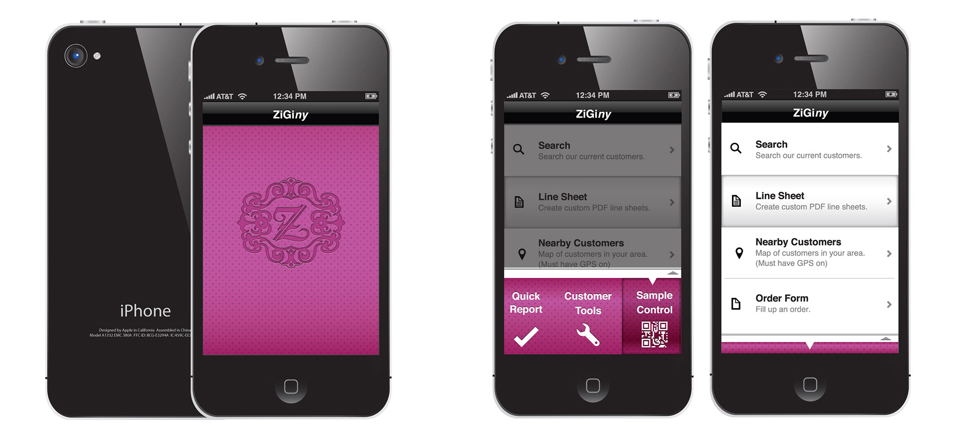
Mobile Application
Zigi (ZiGi) is a global fashion brand that sells shoes.
Problem: Prior to the app, sales reps would have to manually put together line sheets; gathering images, prices and other data, formatting this information and then passing it off to clients. Completing just one line sheet would often take 3-4 hours. Every line sheet was inconsistent and usually sloppy. This looked unprofessional to buyers. Additionally, making sales at trade shows was painful. Orders would be completed on paper and then later entered into the computer.
Tracking inventory was also an issue. Sales reps would often take shoe samples with them to travel between showrooms and meet with clients. If a sales rep lost or misplaced any shoes, there was no way of tracking the loss.
Solution: Design an internal mobile app that would
1. Allow sales reps to complete transactions faster and "on the go"
2. Generate consistent professionally designed line sheets
3. Manage inventory in real time
1. Allow sales reps to complete transactions faster and "on the go"
2. Generate consistent professionally designed line sheets
3. Manage inventory in real time
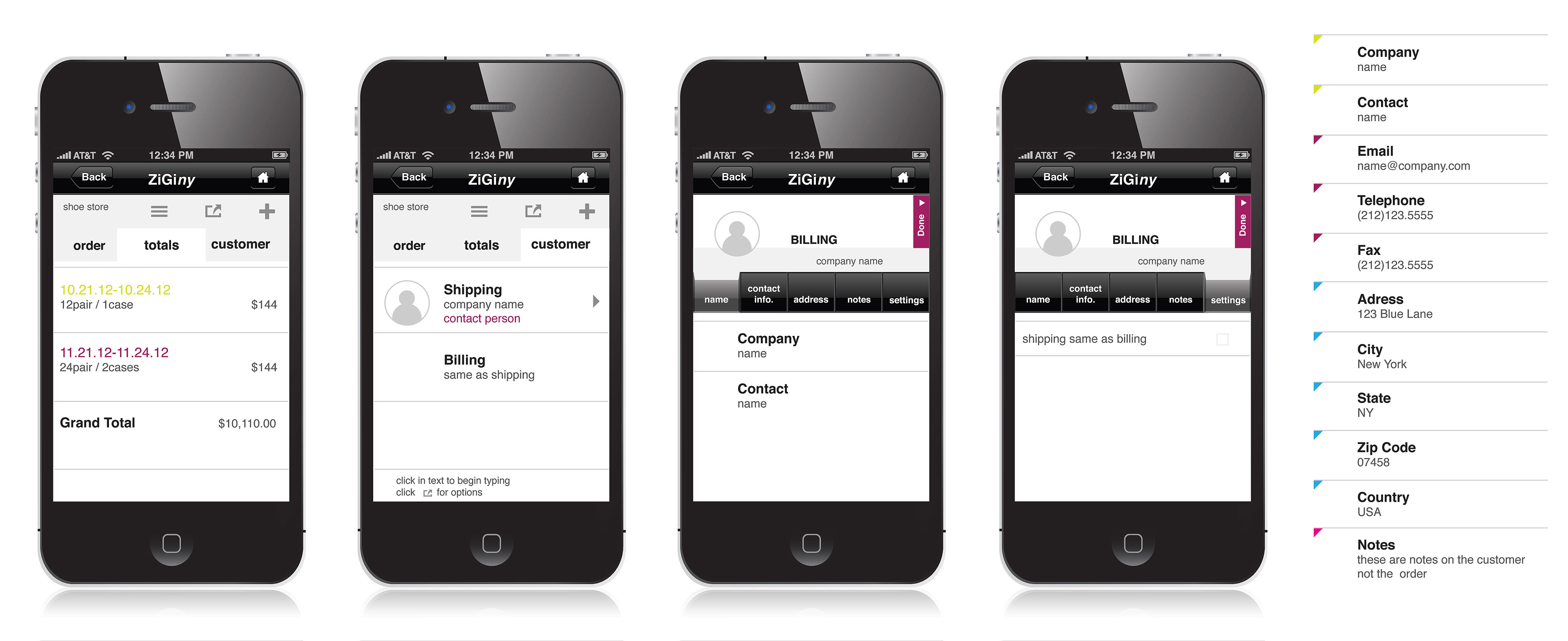
This three tabbed structure (in grey) at the first level and five tab structure (in black) at the second level is consistent throughout the entire app.